Thursday, 25 November 2010

Janine Sykes , advertising and new media lecture.

Aims:
To engage in current academic debates.
To compare this impact to that of the late 19century

Media thats works not through persuasion or impressions engagement and involvement

Sutherland 2001

Old media = back to late 19century
Compact and impact of new media and progress of colour printing

Radio

William Hesketh Lever
1851-1925 Lever bros
Rob wright - the begining in history of advertising
WCRS. 118, 118 and the futures bright the futures orange.

Bill Bernbeck 1911-1982
1st to combine copywriters and art directors

sunlight vision exhibition

Sunlight, lux to lynx
Soap, lever brothers
founders James Daray and William Hesketh Lever

Today Uni Lever, 900 brands, Persil, Sunsilk and comfort

'Ubiquitous brand, part of the average consumers, metal furniture'
(Lewis p57)

William Lever
George Cruikshank (etching)
all the world going to see great exhibition of 1851

Beginning of pre packaging
1860s cereal, figured how to print

Founded
-John and william Kellogg
-Henry j heinz
-Asa candler 1890s bottle coco cola

Soap sold in long
like shop - lush

The first
Lever

I was the first to advertise extensively a tablet of soap - directed at the higher class

Ads and colour printing

Newspapers
-advertising boom
-press owes much to advertising
-press indispensable for advertising

Posters
ethnological progress reproduction and colour printing

posters 1890s
technology enabled contemporary painting to be reproduced

Contempory art and advertising

The soap, means extensive use  uses contempory paintings in their advertising in a case in point
(Lewis, 2008, p65)

Image used in sunlight and soap advertisement with a caption 'so clean'
'the new frovck 1889' william powell forth
Uses children, clean, rosy

'The wedding morning' - John Henry Frederick bacon
generational admirers
clock and cup changed to be sunlight soap
brand loyalty

'Colourful, innovative advertising was crucial to levers success'
Port sunlight museum, 2009

Medical, chocolate and soap manufacturers announced foremost advertisers

Levers achieves
'to convince people - didn't just want soap - needed it.'

Promotion boom - washing event competition
2x steamers, washer women, soap, large crowds and banquet

Royal endorsement from 1892
soap makers to the queen

1903
began wrapper scheme offering own soap and presents in return

Capture the children
'One method beloved of advertisers...was to capture the children'
Using images of upper class children - directed audience

Lever spent 2million in first 2 decades making soap - purchased Philadelphia soap

Art direction
Cross suggested plantol should depict tropical climates and express the care that is exercised in refining oils.
Advocate of forced labour
Palm oil main ingredient

Lever amassed and among innovates of advertising expertise

advocated truth in advertising is an asset falsehood in advertising is a liabitis

Salvation
'Many of his early advertising enphaside that sunlight soap would save women from drudgery'
Answer: washing day toil
solution: sunlight
Copy: a girl of 12 or 13 can do a large wash without being tired
ease a repeated theme
sunlight soap and how to use it spoke directly to working class housewives
-same strategies used today (eg mother and daughter)
-Improves life, leaving quality time for romance


British imperial museum
-civilise
-No commodity aided more in this soap
- Mc Clintock argues 'served to justify the imposition of alien cultural values'

creating customers
sanitary achievement, drains sewage and soap

Pursuade each customer of his/her hygiene problems 
the lynx effect - high feeling

Psychology
The psychology of advertising 1908 , US, Walter Dillscott

Edway Berneys, nephew off...

Discrepanny theory - between self and ideal image of self

Lever bros Lux 'soft youthful lovely femine hands' and celebrity endorsements

America soap operas (radio)

Link between art and advertising
P+G aimed at children, sculpture event - carve out of soap

Crities of admass culture
Boom in consumption

Advocates of admass
economic liberals
Celebrate unfettered agony of the consumers individual
good trade relations between countries reduced conflict

Leverhume speech NY 1923

Back to the future
New media model
more targeted
More personalised
Shift - sturgeon 2008

Viral ads
Distinction between old and new
Voluntary viewing - PC
Forced viewing - TV or print
Definition - unpaid peer to peer communication of content
New coms model

Old - transmission
New - cybernetic
-Engage with audience via computer, cell phones
- a new exciting ways about advertising

Trevor Beatie - Ideas
-Internet
-Enables lots of small ideas to circulate
-The combination of a 'trillion, little ideas is in itself is the biggest idea there is, i think we are at the most interesting point of communications history ever'

Digital media
Convergence of media opens up opportunities for creativity.

Viewer generated content
Case study 'coke menthos'
Viewer generated advertisement

Audienced actively managing media culture

Creating dialog
Paul burns 'talking with audience'
You tube - 'old spice'
- interacts with audience
-Responds to tweets

Oasis 'dig out your soul'
-Virals promoted new album

Youtube ad of the year award
-Embrace life'
Always wear a seat belt


The third screen
Mobile phones will soon become the greatest tool for persuasion
-Fogg

The heiros factor

Presenting desired message at opportune moment
-location
-routine
-goals

My own summary of the impact of new media on advertising


Personally I believe there has been a massive impact of advertising through the use of new media, techniques and solutions, there is such a variation now, its hard to depict categories for each. Voluntary viewing with in websites like youtube gives a whole new outlook on advertising; It can be emotionally stimulating , an example shown in the above video. An empathy method which perhaps can not be done with such an impact through just print. My favourite method, in all honesty is viral ads. The way in which millions will see a video, which begins with just one person sharing it with another, for this to be passed on to several, to dozens to hundreds and so on. Target audience is no longer an issue in which television advertisements have a problem with. If you don't watch a particular channel, the chances of you seeing an advert on there will be slim. But generation own a computer and billions use the internet daily, and for those who don't, word of the mouth will likely get around to them. My own personal example of this is my grandparents. Neither of them use the internet nor own a computer, but when they visit I may show them a video within a website like youtube. It's as simple as that.


Advertising is becoming a very powerful tool, even more so with the range in which one can advertise itself. Peer to peer sharing is a method in which the video maker had to intent of advertising the product in use. "coca cola and menthol" is just one example, see below.


In a lecture we were told of the effect this viral had on sales figures which were astonishing.

Tuesday, 23 November 2010

5 examples of Modernism in graphic design

Bauhaus Logo

Modernist in it's simplicity. There's no ornamental value what so ever. 
Made up of just blocks, no type. No illustrative elements.
Neue Grafik
New graphic design
Graphisme actuel
-Grid
-Grotesk font - inc Helvetica
-Flush left, ragged right text
- no hand drawn illustrations


Marrinetti - 'Parole in liberta' meaning words in freedom
words creating image
Anti ornament
new techniques, products and methods in type
random word placement
not limited to a grid, structure, or have a meaning


Anti-ornamental. 
Literal in it's purpose and intent
Only hand drawn element consists of signature.

Weimar Bauhaus Museum poster

Sans Serif font
Anti ornamental
'Bauhaus' a main modernist contributor to the modernist movement

Analysing an article regarding semitoics

The Sun article page 3 - 'News in briefs'

The main image, being so large suggests itself to be the main focus of the page, anything smaller in size is insignificant. This article is ironic in relation to this, the small amount she does have to say if of great importance and significant, yet it comes across as a comical element to the page. The model in the image says a quote of a renown intelligent person. This paired with her topless image of herself, linked with our cultural codes means we see this woman as a stereotype; a long haired, well endowed, un-interlectual woman who's only mean of making money is through selling her sexuality by posing nude for newspapers, the image in fact naturalises women's apparent stupidity. This, may in fact, be true, but it's more than likely it's not. Considering her very intellectual 'what she had to say' column, reciting an einstein quote connotes an element of high education, denoting high intelligence and status. But the image, and this column paired together adds an element of humour, it in fact humiliates her as a person as we have already denoted her, we as a reader feel the need to almost laugh at it. The two are just so contrasting within cultural codes.

The text to the side of this article, shows this article's intended audience to be for men, the texts symbolises just that, writing, a typeface containing the models name, age and location. The denotation of this is the use of a masculine orientated font, using sans serif, partially capitalised and the colour of blue which also detonates masculinity.

The conotation of women here, has been played with for humorous purposes. The suggestion that she's inteligent is 'funny' due to the already given stereotype by society; the myths of felinity.

An introduction to semiotics

What is semiotics?
A science of studying signs - Something that gives a meaning in culture.
The study of how things mean, not what things mean - Cultural code.

To read culture in the same way we read language.

Fashion is a cultural code. A 'punk like' attired man - a rebel subverting. Image of man in tie and suit - societys consensus - smart, status, business, societies view. Tie - purely symbolic - no function.

The word dog - no link to actual animal - no natural basis

Image of rose:

Signifier : Rose
Signified: Romance

Word rose in italic, femine writing:

Signifier - pink, the words, typeface - vehicle for language, signifier in own right.

Signifier demotes and connotes.
Signifier, split into denotation and connotation.

Connotation relies on culture and social experience.

Myth: image of black boy saluting french flag. Culture disguised history and meaning - in link to race.
Black - Negative, death
White- Clean, positive, angelic
French ideology - Everyone equal
Colonial power - myth - france tries to make blacks forget - disguise.

Myth - hard to spot, seems so natural

John constable , the haywain, 1821


Represntaive of social order, connotes Britain - calm and beauty of one specific persons lands. Not a true selective version of events. Was a myth, now a truth of how we believe England is like.

Image of st georges cross flag:
Everything infused in this one sign. Flag dennotes England, Connotes much more: green and pleasant land etc.

image of seductive woman promoting wonder bra:
Connotes : sexualise self physically rather than interlectually. Naturalisation of womens stupidity.

Hans Memling 1485, 'vanity'
Calling a woman vain, when infact it was a man who painted the woman in this sexual way.

'APHRODITIES' font stereotypical, relating to context

Wednesday, 17 November 2010

'The document' Lecture

Aims:


  • Introduce documentary photography and conflict
  • Introduce the work of mass observation mehnum and the fsa photographers.
  • Explore questions and objectivity and subjectivity.
Joseph Nicephore Niepce 1826
'View from a window at Lagras'

Photography took over the medium of painting as representing the world.


James Nachtavey

'I have been a witness, and these pictures are my testimony. The events i have recorded should not be forgotton and must not be repeated'

States photography is the document of the world at a moment which isn't to be questioned; evidence. To document, investigate social change, a record of history, to relay information to others.

To risk to take a photo to show the world what is happening - to negotiate for peace.
Photographers go to war to show others - to grab attention, to give understanding to others so you want to help. It's not just a record of events, taking a subjective stance, political position. An attempt to pursuade, exposing this for the benefit of humanity.

'Palestine 2000'
Seeks to align and create bonds between subject, audience and photographer.

'Sudan 1993'
Not neutral, sense of empathy.

Francis Frith (1857) 'entrance to the great temple'
Neutral

William Edward Kilburn
'The great chartist meaning at the common' 1848
Subjective
Photographer removed, not involved, not authentic.
As this image will be in history, its our only idea of this event is subjective. Idea's are skewed.


Henri Cartier Bresson
France. Paris. 'Place de l'europe'. - An example of the decisive moment. 
'Gare saint lazare' 1932 - Makes visual links - style. Studies his scenes - composed.
Does documentary photography - cares for its aesthetics

Jacob Riis 1888 'Bandits roost'
recording poverty - record to show how the other half live
Composition - Not the invisable eye.
Posed subject
Presenting sense of self. not real, not a depiction of life.

1887 'grouler gang in session (robbing a lush)
Staged. Acting. Artificial representation.

Lewis Hine, 'Russian Steel Workers, Hamestead, pa, 1908'
Presented as 'normal people/

Definition of OTHERING:The Other or Constitutive Other (also the verb othering) is a key concept in continental philosophy; it opposes the Same. The Other refers, or attempts to refer, to that which is Other than the initial concept being considered. The Constitutive Other often denotes a person Other than one’s self; hence, the Other is identified as “different”; thus the spelling often is capitalised. - Taken from http://en.wikipedia.org/wiki/Othering 


F.S.A Photographers - 1935 - 1944 - Photographers ordered how to take and what pictures to take.

  • Dirctor Roy Stryher
  • Depression - 11 million unemployed
  • Mass migration of farm labourers 'oakies'
  • The photograph of both photojournalism and emotive lobbying tool.
Roy Stryheer to marion post
Jan 13th 1939 - instructed what to take

e.g Margeret Bourke-white
'Sharecroppers home' 1937
emotive poverty

Russel lese 
'interior of a black farmers lounge'
1939

Dorothea lange 1936
Migrant mother. - The image of the great depression
Image choice to represent world
-some scrapped, some used
-photos chosen are meant to represent time - its not accurate - biast - our history skewed and controlled
'Paphael Madonna and child'

Walker Evans
'Grave yard, house and steel mill, bethlehem, Pennysylvania,' 1935
-representing of lifestyle, work, live, die.
Still aesthetisized.

John Lamprey 1868
'Front profile of views of a malayan Male'
New project - ethnigraphic. To compare and contrast with us.
Used to justify, scientifically - black inferior to white.

Cesare lambroso
Portraits of italian and german criminal 1889
aim - justifying scientific representations
used to stereotype
e.g receeding chin = criminal quality

Mass Observation 1937 - 1960
Social science project
Half political, half social.
Working class sending in photo diarys aswell as proffesional photograph
-Tom Harrison anthropologist
-Charles madge-post
-Humphrey spender - photographer
Still the idea - camera invisible eye
Neutral democratic view of working class. Shared vision. More accurate record of world.

WAR/CONFLICT PHOTOGRAPHY
Robert capa 'Normany, France' 1945
Striking image of human experience.
Photographer dealing with same horror, images only here- dependant on technology

Magnum group - founded 1947
cartier - bresson and capa
-ethos of documenting world and social problems
-Internationalism and mobility

LOOK AT A MAGNUM PHOTOGRAPHER
Aethetic techniques in particular

Robert Haeberle 1969, people about to be shot. Massacre, vietnam.
Interveened to take picture - the last image of them alive.

Key features of documentary photography
  • They offer a humanitarian perspective
  • They tend to portray social and political situations
  • They purpose to be objective to the facts of the situation
  • People tend to form the subject matter.

Tuesday, 16 November 2010

Modernism overlook - 16th Novemer

Rejection of ornament Adolf loo's, 1908, ornament and crime.

Form follows function, Louis Sullivan, 1896, 'The tall building artistically considered

Form follows function - Graphic design - to communicate.

Modernist graphic design. Simple. e.g road signs, pure communication, no aesthetics.


Cheret 1884


Toulouse - Lautrec 1891 - Modernist but no form following function, instead showing modern social relations and engages new forms of leisure.


Marrinetti - 'Parole in liberta' meaning words in freedom
words creating image
Anti ornament
new techniques, products and methods in type
random word placement
not limited to a grid, structure, or have a meaning


Marrinetti was a leader of futurists
1909 'Futurist manifesto'
An embrasion of the modern world


Fortunato Depero, 1927, bolted book.
'Modernist, futurist, typographer


Appollinaire, 1918, ll pleut
a poet, using a modern layout of type.

Jan tschichold - The new typography 1927
-No fonts except grotesk fit - Unornamental
-Frakhur plain - dangerously nationlist - connotations - opposite of what graphic design should be.
-Tschichold critiques this
-Its is nationalistic, historic


Neue Grafik
New graphic design
Graphisme actuel
-Grid
-Grotesk font - inc Helvetica
-Flush left, ragged right text
- no hand drawn illustrations

BOYNE & RATANSI 1990
Postmodernism and society
 tendencies of modernist art and design
-Aesthetic self reflectiveness
-Montage
-Paradox, ambiguity and uncertainty
-Less of the integrated individual subject
-optimism

Aesthetic self reflectiveness
-almost reflect on themselves of medium in own creation
Modernist art - less about representing something - commenting on medium itself.

e.g Painting of dripping paint. Reflection of what is needed to be done to paint.

Aesthetic reflexivity 
Bauhaus building - Lets you read how it was made

El lissitsky 1924 advert for pelican ink
meditation of process
reveals process of its making
Man pay 1924 gun with alphabet stencils

Montage g.klucis, in the storm of

Paul Citroen, metropolisis, 1923
loss of individual subject
representation of world without fixed identity - where do you fit?


Hannah Hoch 1920 die schou madchen
lost in industry, advertisements, self; defining ourself

Modernism moves away from an illusionistic 'realistic' way of depicting the world and instead relies on signs and symbols, moves away from realism.


Saturday, 13 November 2010

MODERNITY AND MODERNISM

Keyword:

  • Modernism - e.g- ikea furniture, mini skirts, stilletto heels, new, different
  • Modernity - Industrialisation - A period in time 1750 - 1960...from then on modernism era.
  • Modern - The theory is its better than old


Cailebatte 'Paris on a rainy day' 1877

This painting is showing this to be the new Paris - a city of both new and ancient aspects. This painting doesn't have a focus point; this was a new era of painting, previously all artists would have a focal point within a piece, this shows Paris as a whole, containing many elements of the city - this becomes the subject of art, a personification of modernity - again linking to this term, the lifestyle shown within this painting shows clothes signify identity, displaying status and wealth. A modern way of life is displayed though the activity of walking the streets showing your wealth to be a new leisurely activity.


Haussmanisation

To re-design Paris, in 1850, it was modernised. Old Paris as renound for narrow street, and was quite run down. Crime was at a high level, and the need for a re-design for more people to be attracted to the city was at a need. So the 'New Paris' was in favour of large boulevards; making streets easier to police. But in order for this to be done, many building needed to be removed, and as a result, this pushed out the working class to the outer city. The centre of the city was now an upper class area, promoting the image of the once run down city.

Paintings now show alienation, people looking at change and modernity - ponde Europe.


William Holman Hunt, The hireling shepherd, 1851

This painting, really is a symbol of modernism itself. Containing a moral lesson, in this case, the man has been distracted by a beautiful woman. Whilst all of his attention is on her, the flock of sheep he is meant to be keeping is eating crops and causing mischief. Overall it's sending the message to keep focus on what your doing and not to get distracted. This is a new method of painting - rather than just being aesthetically pleasing, it now has a 'modern' purpose.


Urbanisation

People start to shift towards towns - Industrialisation, life now goes from rural to urban. Changed in transport, new roads are built, ships are available to public, the telephones invented, railways expanded - people are no longer seperate from everyone, and can shift great distances. There are also new forms of leisure, the cinema, galleries, shopping is now considered a leisureable activity. Before modernity there was no regulated time, but within the modern era, there is now a regulated time agreed, meaning work within factors now consist of shifts.

Enlightenment

This was a period in the late 18th century, in which scientific thinking makes leaps and bounds, no longer relying of religion - secularisation-a new way of life.

Phycology
An 'Experiment of attentiveness to sound location' was done within 1893. People were now becoming afraid modernity was affecting us.  The city was now a condensed social space, in which the poor and rich were forced to see eachother, making people distance - dehumanising city space. There was an obvious class division.

Seuret 'Sunday afternoon on La Grande Jatte' shows a new method of painting, the use of dots to create an entire image, developing a new science. This image shows the mixing of classes, the lower class sitting on the bank whilst the upper class sale in their yachts, showcasing their wealth. This shows a condensed social space, the poor and rich forced to see each, making people more distant and dehumanising city space.

'L'absinthe - Degas 1876. This really is an iconic painting, showing the negative impact of modernity, portraying life as terrible, alienated. Here a woman is seen to be 'drowning her sorrows' at the state of modern life and social relations.


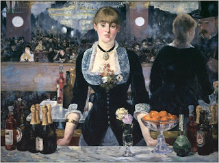
Manet - Bar at the Flies Bergere 1881

Serving the wealthy, so part of it, but not allowed to access it completely, just works for the upperclass.

The Kaiser panorama was invented in 1883, a new distancing device, people apparently now prefer to see the world through a lens than realistically.

The cinema was also invented, which as it came about, the moving image terrified people but also became a fascination as a new way of the world. Of course, there were anti-modernists, who were fearful of what was happening.

Subjective experience: Experience of individual in modern world. Artists now gave a subjective response to the conditions. Modernism emerges out of the subjective responses of artists and designers to modernity.

Alfred Stieglitz - Flatiron Building - 1903.
This really evokes the message of modern towering above natural, and it itself it a product of modernity, it's form was dictated by purpose, and is yet another way of seeing the world, from high above.

New methods of work came about, Paul Citreon, metropolis, 1923, uses photomotage.


Modernism in design.

Define:
Truth to materials: should let new modern materials speak for themselves, e.g a metal chair, don't cover up to make it look wooden.
Form follows function - For a purpose, not aesthetics.
Anti-historicism - No need to look like an older style


'Ornament is crime' Adolf (1908)

Over flourishing - A sign of backwardness, should have no desire to over aestheticise.

Bahaus - No nonsense, purely functional, not beautiful - this comes form simplicity. Truth to materials, simple, geometric forms appropriate to the material being used. Bahaus designed the vetura font, and re-wrote how art was taught. The building in which this was done was shut down by the nazi's as they felt it was too progressive.

Bahaus, 'Le corbusier lc2'
New materials also came about:
Concrete
Steels
Plastics
Aluminium
REI Glas

Mass production was also quicker and cheaper.


Le corbusiers "Plan voisin' 1927 
This was his ideal city design

Internationalism: a language of modern architecture design that could be understandable by anyone in all cultures and backgrounds - can be understood on an international basis.

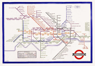
Harry Beck, Underground Map, 1933

Herber Bayers - Sans Serif typeface, argued there's no need for caps, everything should be in lowercase.

Times new roman - Stanley Morison - 1932 
Created at the same time as Ventura
Aiming to bring linear, classical and contempory

Frakhur Font
Nazi's used, roots to gothic empire

Modernity 1750-1960 social and cultural experience
Modern - Not a neutral term, suggests novelty and improvement


Importance of modernism

Vocabulary of style, art and design education, idea that form follows function.

Modernism - the range of ideas that sprang from modernity.


Tuesday, 2 November 2010

Image Analysis Exercise

The two articles in which we have to compare and write a 500 word analysis on.

The uncle Sam Range (1876) advertising image by Schumcher and Ettlinger, New York


UncleSamRange.jpg


"Daddy what did you do in the great war?" - Savile Lumley (1915)


daddy.jpg

  • The choice and organisation of font and style of illustration
  • The purpose and meaning of the image
  • The target / Potential audience of the image
  • The social and historical contexts relevant to the production of the image.


The two pieces of graphic design at hand, are outlining two very different topics; 'The Uncle Sam range' poster is advertising a range of of ovens whilst the "Great war" is dealing with the topic of the World War; two very contrasting pieces  in subject matter, but both hold a key purpose; to persuade. 

The "Great War" poster holds many symbols relating to it's country. The chair holds a pattern which are symbols of royalty, the young boy is playing with figurines made to look like the palace guards which is symbolic of the pride for ones country, this relation is made due to the red attire, which is also worn by the boy. The general attire worn by the family is very British. The poster in itself is representing the idea that you have a duty to the queen and country, this is a guilt trip in an attempt to feel you have to serve in the war; a persuasive device.

Whilst the "The Uncle Sam Range" poster is attempting to sell a range of cookers through the use of a socio-historical context and a mass amount of American related symbols, similar to the "Great War" poster. It's using the idea that Americas superiority is above all other countries development; using the element of food to show this. An image of the globe, which holds the name of Europe, Asia and Africa (Africa represented by an idiotic face, potentially a racial statement), is reading a list of awful foods from particular countries. This paired with the image of Uncle Sam offering a vast range of glorious food, shows the attempts to boast about how America has such a high status. This in link with the type present "Uncle Sams Little Diiner Party 1876" and a clock showing this date, and 100 years previous (When America became an independent country), shows the intention of the poster, which is to sell the dream of American superiority, persuading people to buy this particular range of cooker as it is 'the best', being American.

Type has a massive affect on the persuasive devices used, within the "great war" poster, lower case, speech imitated type is used which gives a personal quality to the poster. In context, the little girl is saying this to her father. The "Uncle Sams Range"  poster uses a typeface which is designed to make you think its gold, again relating to America's apparent superiority. 

Propaganda is apparent in the "great War"poster, the image content used is clearly present tense, it's showing that all is well in the future after the war, that it's been remembered as a "Great War" (due to the text used), so much so its in children's books and figurines have been made in relation to it, it's trying to romantise the idea of joining the war, again another persuasive device at hand.

Although different in content, each poster has used persuasive elements based on individual opinions, elements including propoganda, sexism and racism in an attempt to sell a product, or get you to join your country at war.